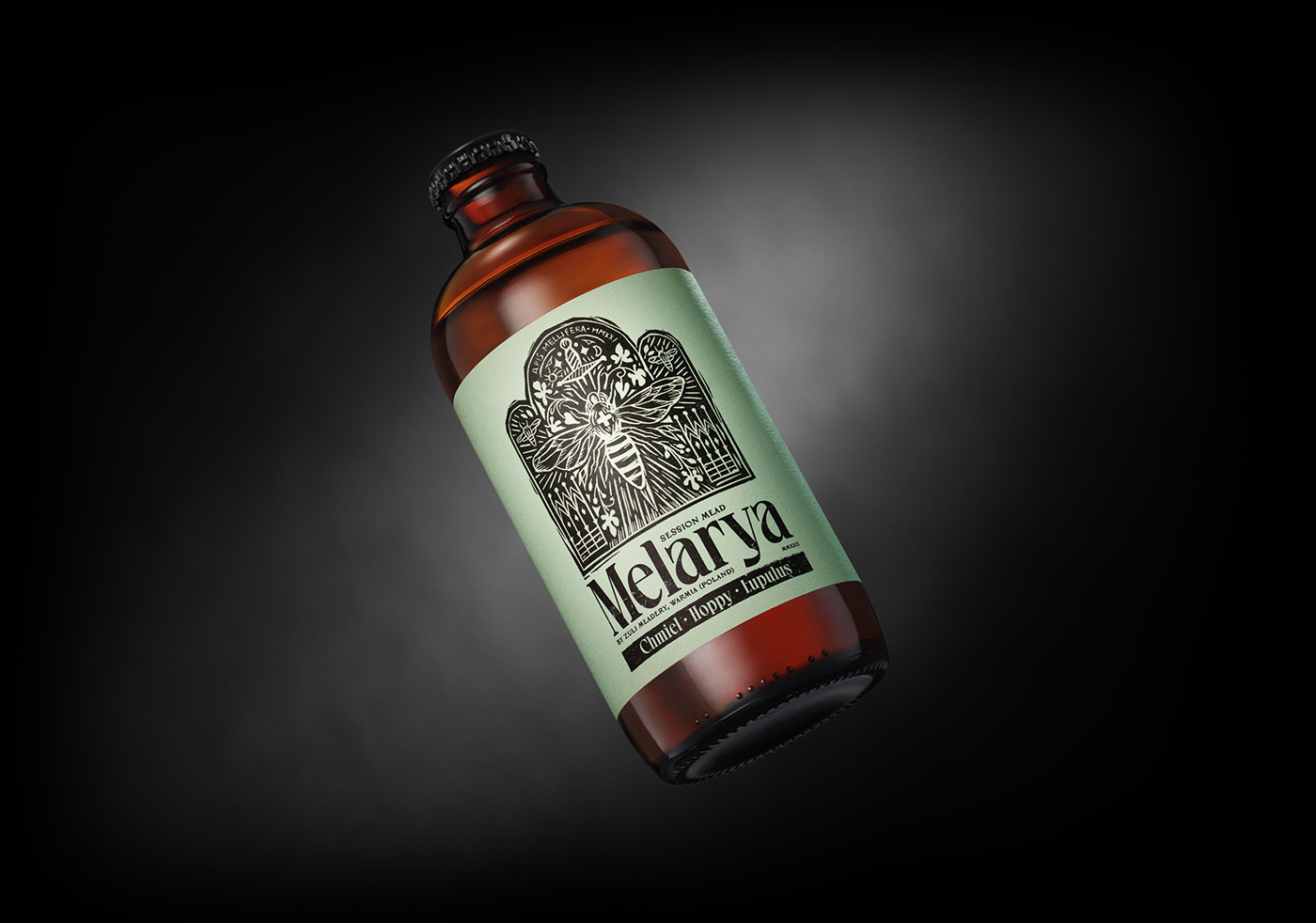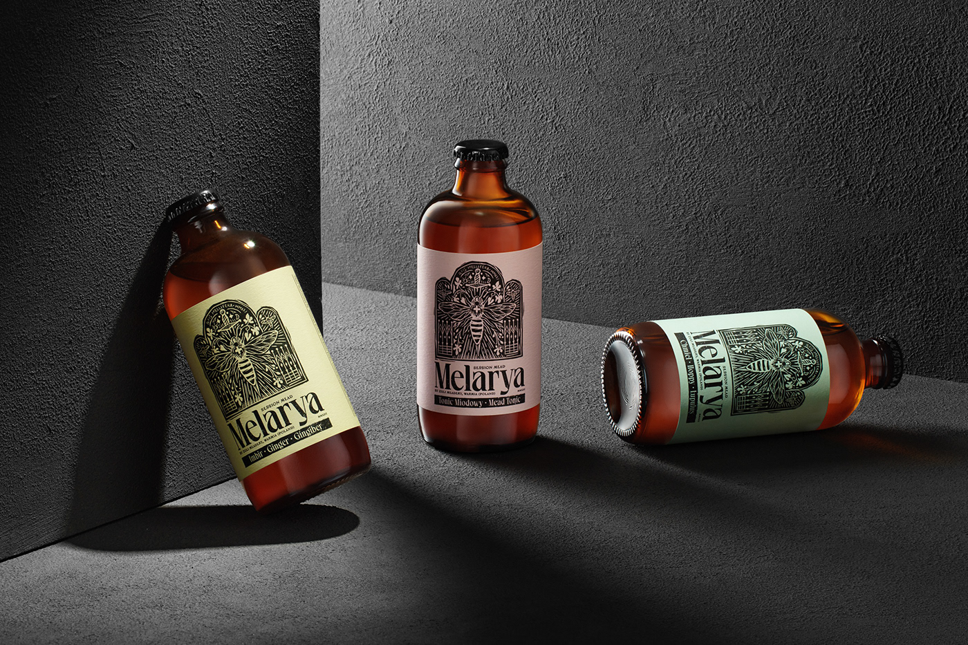
The enigmatic Melarya brand was created in the backwoods of Warmia, among fields, forests and lakes. The name could suggest connotations with a deadly epidemic. But it is quite the opposite. Mel or mellifera in Latin means mead. And Melarya, is a variety based on mead, hence the prefix mel in the name. It is a unique alcoholic drink from the ZULI Craft Meadery in Kabikiejmy, Warmia, which, thanks to its honey base and natural additives: ginger, hops and quinine, can have a beneficial effect on health.
instagram: @flovcreative | work with us: studio@flov.co | all rights reserved © FLOV 2022


Labels
The brand is actually the product, which is special and unique in itself. Therefore, we did not want to "break up" the project into additional (in our opinion redundant) elements of identification. We found that in this case, we must focus as much as possible on the characteristic packaging, in particular on the label, which should include an interesting, illustrative motif and the unique logo of the product referring to it.


Illustration — Linocut process
The reference to an infectious disease seemed a bit perverse to us at first, but we came to the conclusion that it nevertheless brings with this idea a lot of creativity. Especially since the product hit the market during the pandemic. Due to the healing properties of honey and health-promoting additives, we decided that the product should look like a magic medicine or elixir sold in mysterious, forgotten pharmacies. We came up with the idea that the drink should be poured into brown, bulky bottles, resembling old medicines. The shape and color of the bottle made the product immediately separate from all soft drinks products and took on its specific character. In turn, the inspiration for the illustration of the label was the historic epitaph from the period when the plague epidemic broke out in Warmia. The graphics contain a few themes related to the product and the region where it is made. This composition, however, is dominated by the image of a bee, which is stylized a bit like a doctor or a healer who brings relief and helps the needy ones. It is worth to emphasize that the illustration was created entirely in a traditional way, i.e. as a hand-made linocut.


Small details
Melarya's vibe was further enhanced by the use of monochrome illustrations and label layouts that were printed on single-color uncoated paper with a distinct rough texture. Thanks to this, we got the impression that the product is produced by home methods in small batches, which perfectly fit into the concept of a mysterious elixir.